A Silver Lining In The Wake of Coronavirus - Update
March 29, 2020
A few weeks ago, I took a look at the CDC figures for pneumonia and flu mortality rates to date in 2020 as compared to the previous five years. I was surprised to see what seemed to be a signficant drop in rates in the first weeks of this year compared to previous years.
First, some bad news: the mortality figures for late 2019 and 2020 into March were adjusted upward. I went back to check previous figures, and they seem to get updated as the year progresses. This is probably because of the sheer number of locations throughout the United States reporting figures, with delays inevitable.
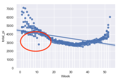
That said, the overall trend in low pneumonia and flu mortality rates continues. Here is how the mortality rate for pneumonia appears on a weekly basis currently, at week 11 (through March 14):
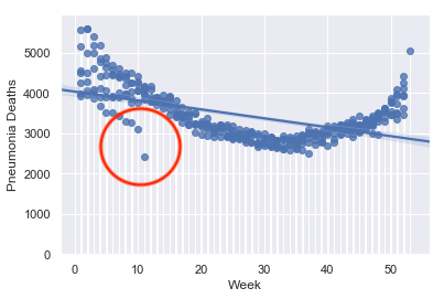
These are the general trend lines by year through week 11/mid-March in each year. As you can see, despite the slight readjustment in figures for 2020, the trend line is still steeply negative compared to all the other trend lines from 2014 onward (compare with the by-year graphs a few weeks ago).
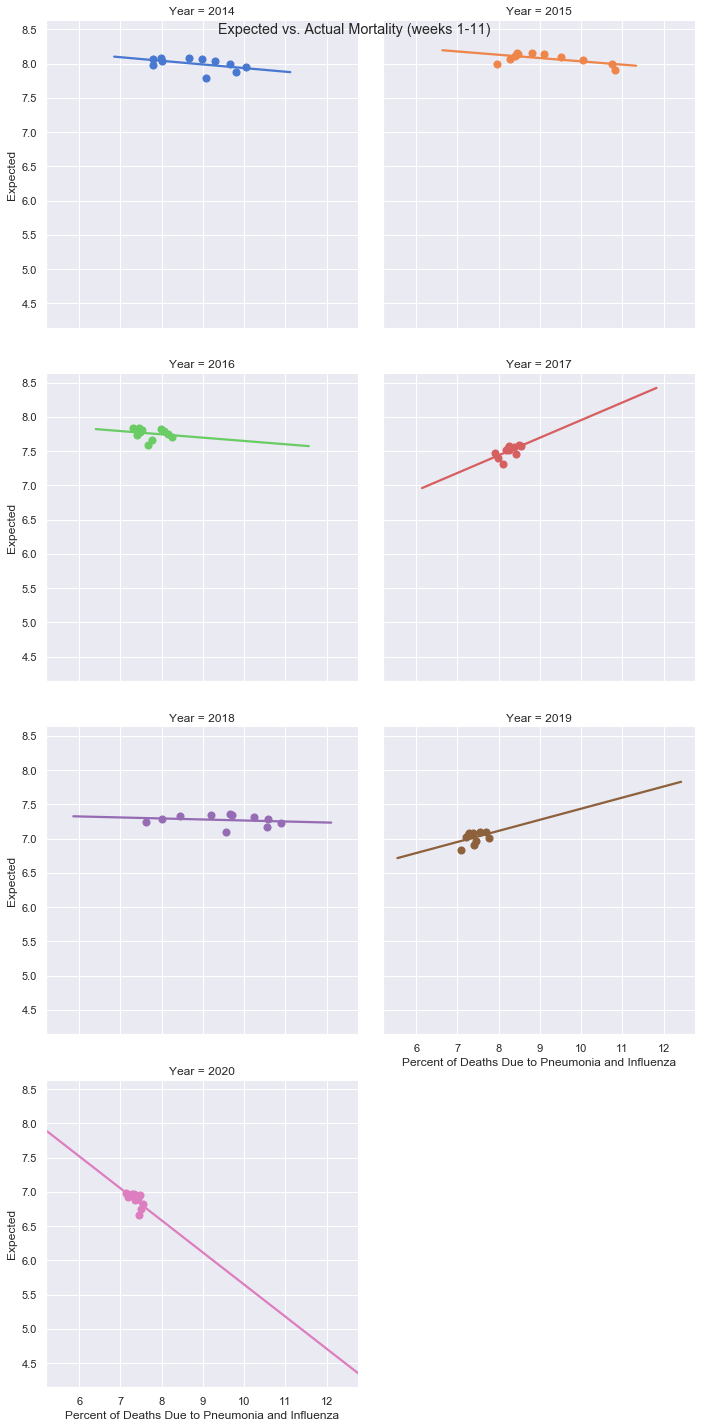
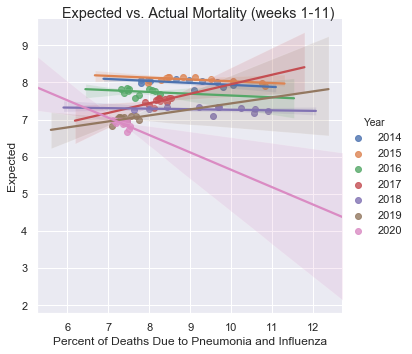
And here are the trendlines on one graphic, for further reference:
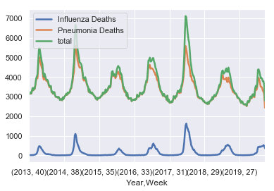
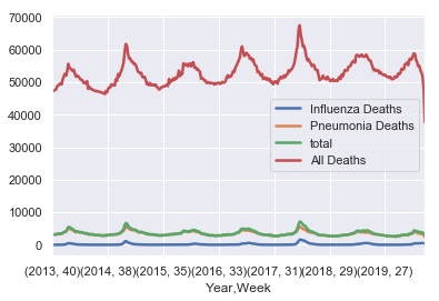
Here are the general trends of pneumonia and flu mortality figures since late 2013:

Here are the mortality rates for pneumonia and flu since late 2013, along with the total figure plotted in green:
While it is perhaps not visible in the above charts, flu mortality rates are trending slightly higher than the previous year, while pneumonia mortality rates are definitely lower. Even when taken together, though, they still are below pervious years’ trends at the same time of the year:
And here are pneumonia and flu deaths compared to total mortality in the United States from late 2013. Intriguingly, overall mortality seems to trend slightly upward since 2013.
The above figures are little consolation to those afflicted by Coronavirus/COVID-19. To be sure, we’re not out of the woods yet. In fact, residents of the entire Washington-Metro Area are under stay-at-home orders potentially until mid-June. Equities markets, and with them Thrift Savings Plan share prices, have trended upward, but this is little consolation to the 3.28 million who filed for unemployment in the past week. It was quadruple the previous record…
The lengthy stay-at-home orders throughout the country will only serve to drive markets down further in the coming weeks, in my opinion, unless we see a major break-through in effective therapies or even the development of a vaccine in the near-term. Still, for those fortunate enough to be able to remain invested in their TSP accounts and 401(k) plans - based on research and data I present in TSP Investing Strategies - this is a time for buy-and-hold investors with long investing horizons to remain invested in their stock funds even if we might be headed for another market decline. These can be opportunities, as they have presented themselves throughout the past 100+ years. It will take time to recover, but we’ll defeat this epochal global health crisis and come out better for it.
(This will probably be the last time “clean” figures for pneumonia and flu mortality rates are available for a while, as Coronavirus fatalities increase in the United States in the second half of March and beyond.)
Stay safe, and stay healthy!
Related topics: long-term-investing tsp-updates